Color has always played an important role in design.
Your designs could easily become confusing and pain in the eyes if you don’t understand and learn by heart the golden rules for selecting a color scheme.
In this post, we’ll walk you through the 6 most important rules. Read on!
Monochromatic
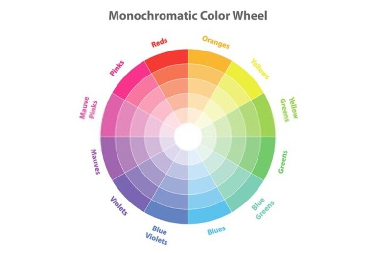
This is a very popular color scheme, especially in logo design or in minimalist home designs.
It either includes just one dominant color or combines the original color with multiple shapes so that they will resonate with each other and form a monochromatic color scheme.
Since it’s neither fussy nor complicated, the monochrome color scheme looks very pleasant to the viewer. Its simplicity prevents your eyes from being too distracted by other elements so that you’ll be fully focused on the important features, such as content.

This rule is also used to make simple typefaces become sharper and more attractive.
However, that simplicity (and sometimes somewhat monotonous) makes it difficult for the designer to accentuate some details in their work.
Analogous
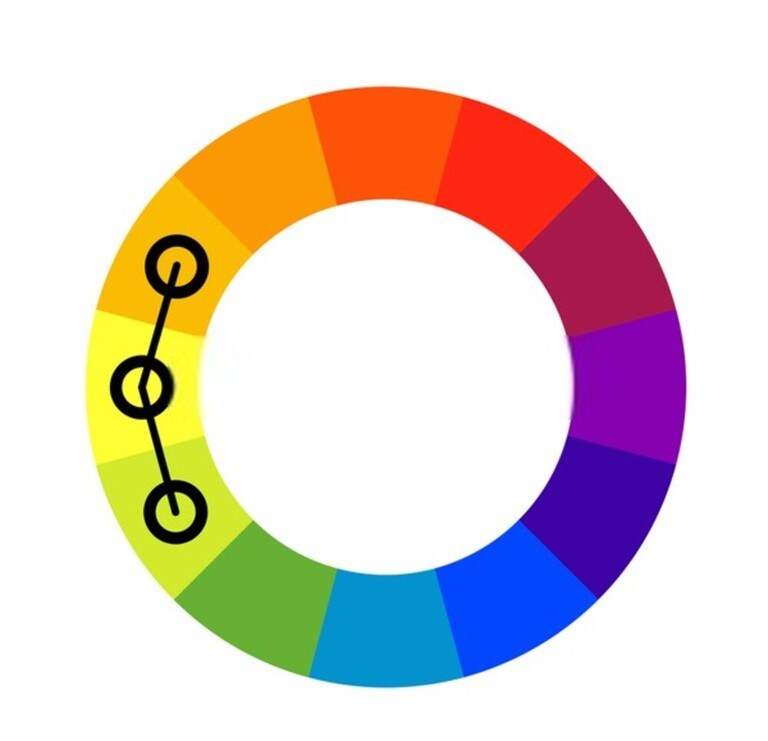
This rule works very well with colors next to each other on the color wheel; thereby, creating very courteous and attractive color schemes.
Although there is a mix of colors, since they sit next to each other on the color wheel, the color scheme is not too confusing and complicated. On the contrary, it is very calming and pleasing to the eyes.
Compared to the monochromatic rule, this one offers more various color choices. So, when using them, you can easily distinguish the different contents of a product.
How to use analogous rule
An analogous color scheme commonly includes three colors sitting next to each other on the color wheel. For example:

The very first step is to pick out a dominant color. This color will then be used the most and the other ones should interact well with it.
The second color takes the role of distinguishing important parts of content on a product. And the third one is for not very important details (usually for decorative details).
Complementary
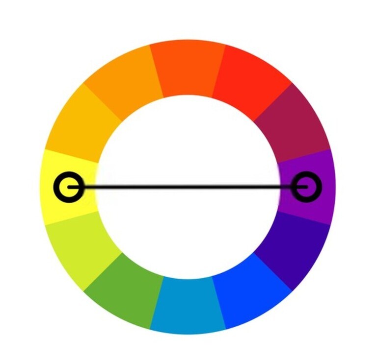
This rule uses matching pairs of colors on the color wheel to create dynamic and energetic color schemes. Obviously, with the pair of symmetrical colors used, it is very easy to give points to important details.
Also, because of the contrast between colors, complementary is completely out of place if your product has a style of relaxation and lightness.
Similar to analogous, designers will pick out a dominant color. From there, they’ll find the contrasting color.
Note: This rule doesn’t work well with desaturated colors because they will lose the high contrast between pairs of colors.
Triadic
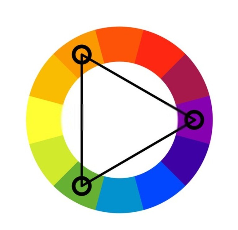
This is the safest rule out of a bunch.
It is formed with three colors sitting at three different colors on the color wheel as long as they create an equilateral triangle. Because of that, these three colors combine and complement each other to bring a balance to the whole color scheme.
Some designers really love to use this rule because their customers regularly leave good feedback such as harmony and balance of the color used.
But we won’t recommend you try this rule if you want to create an accent on your product. Triadic is sometimes too safe and the color scheme looks very monotonous and underexposed.
Split-Complementary
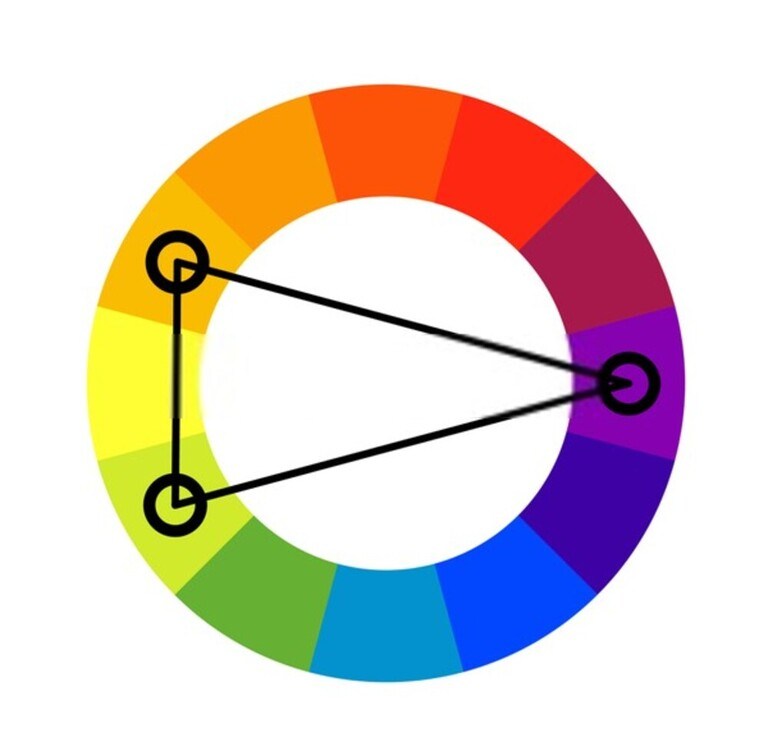
This is perfect for those designers who want their product to be attractive and impressive to the users from the very first glance.
Split-complementary is made up of three colors located at three different angles on the color wheel as long as they together form an isosceles triangle.
You can add one more color as long as it matches one of the two colors that make up the base of the isosceles triangle.
Because of the flexibility in color selection, it brings numerous opportunities to designers to explore and find unique color pairs for their products.
Split-complementary is very popular these days and it’s mainly made up of two main colors – white and black, adorned with the eye-catching third one (such as red, green, or blue), along with extra details.
This rule is simple and safe but very effective.
However, to make it a little bit more challenging, you can use those vibrant colors (like yellow, red, and blue) as the main one.
Compound Complementary or Rectangular Tetradic
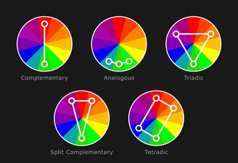
This rule is the most complex out there. But if you take extra effort and time to choose colors carefully, it will make your product look impressively new and modern, very suitable for many current design trends.
The color scheme is made up of two pairs of direct complementary colors, the contradictions, and complementarities of which are also its strengths as well as unique characteristics.
At first, these pairs of colors seem to be difficult to coordinate and use properly. In other words, it will take you extra time and effort for selecting and coloring your products.
A trick to make this step more easy and quickly is to balance out between red and cold colors, such as between red and blue or yellow and purple.
Conclusion
Above are the 6 golden rules for selecting a color scheme that you need to know. Hopefully, this post gave you many pieces of useful information. Thanks for reading!


